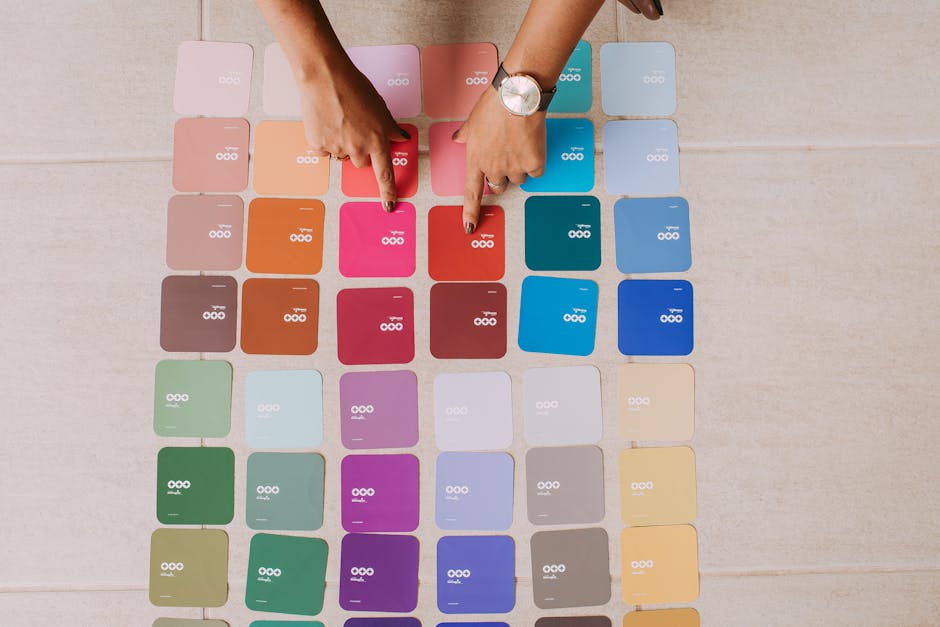
You already know that blue signals trust and red signals urgency. So does every other entrepreneur who has ever read a beginner’s guide to color psychology. And that is exactly the problem. When every financial brand defaults to blue and every food brand defaults to red or orange, color stops differentiating and starts blending.
The real power of color psychology in branding goes significantly deeper than color-to-emotion mappings. It involves context, contrast, cultural nuance, and the competitive landscape of your specific category. Understanding these layers is what separates brands that use color strategically from those that use it decoratively.
2. Why Simple Color-to-Emotion Rules Are Incomplete
The classic associations, blue equals trust, green equals nature, yellow equals optimism, are real but incomplete. They describe tendencies in a vacuum. In practice, color perception is shaped by at least three additional factors that the simple rules ignore entirely.
Context changes everything. The same shade of red that signals danger on a warning sign signals excitement and energy on an athletic brand. The same green that signals environmental responsibility for a consumer goods company signals financial growth for an investment platform. Color does not carry a fixed meaning. It carries a meaning that is shaped by the surrounding context.
Saturation and brightness matter as much as hue. A deep, muted navy communicates very differently from a bright cobalt, even though both are technically blue. Muted, desaturated tones tend to signal sophistication, restraint, and maturity. Bright, saturated tones signal energy, accessibility, and confidence. These distinctions are often more commercially important than the choice of hue itself.
Cultural variation is real and frequently overlooked. White is associated with purity and celebration in many Western contexts but with mourning in parts of East Asia. Red signals luck and prosperity in Chinese culture but danger or political associations in others. Brands operating across multiple markets need to audit color choices against the specific cultural contexts they are entering.
3. The Competitive Landscape Audit
Before choosing brand colors, the most important exercise is not researching color psychology. It is mapping the color landscape of your specific competitive category. The goal is to understand what colors dominate the space and where the genuine differentiation opportunities exist.
This audit is simple to conduct. Collect the logos and primary brand colors of your ten most direct competitors. Arrange them visually. You will typically find that one or two colors dominate the category, with most brands clustered around them.
That cluster represents a risk and an opportunity simultaneously. Matching the cluster makes you blend in with established players, which can be useful if you want to signal category membership quickly. Departing deliberately from the cluster creates instant visual differentiation, which can be powerful if your brand strategy supports standing out from the category norm.
Brands that have used this counter-positioning effectively include Cadbury, whose distinctive purple color stands out dramatically in a chocolate category dominated by reds, browns, and golds, and T-Mobile, whose magenta differentiates immediately in a telecommunications space dominated by blue.
4. Primary, Secondary, and Accent: Building a Color System
Most brand color mistakes involve treating color as a single choice rather than a system. A brand color palette is not one color. It is a set of colors with defined relationships and roles.
The primary color is the dominant one: the one that appears most frequently and carries the strongest brand association. It should be the color that, when seen without any other branding, begins to trigger recognition of your brand over time.
Secondary colors support and complement the primary. They provide variety and flexibility across different applications without diluting the core identity. They are typically chosen for harmony with the primary and for functional utility across digital and print contexts.
Accent colors are used sparingly for emphasis, calls to action, highlights, and moments where the brand needs to draw attention to something specific. An accent color that is used too frequently stops functioning as an accent. Its power comes from restraint.
A well-constructed color system should work across every brand application, from a tiny favicon to a billboard, from a dark-mode interface to a printed document, maintaining recognition and coherence throughout.
5. Color Accessibility as a Brand Requirement
Color accessibility is both an ethical responsibility and a practical business consideration. Approximately 8% of men and 0.5% of women have some form of color vision deficiency, according to the National Eye Institute. Design that relies entirely on color to communicate information excludes a meaningful portion of any audience.
Accessibility requirements also mandate sufficient contrast ratios between text and background colors for digital interfaces. The Web Content Accessibility Guidelines specify a minimum contrast ratio of 4.5:1 for normal text. Many brands fail this standard, creating legal exposure and excluding users unnecessarily.
Beyond compliance, accessible color choices often produce cleaner, more readable design. The constraints of accessibility are frequently design improvements in disguise. Building color systems that meet accessibility standards from the beginning is significantly less costly than retrofitting them later across a mature design system.
6. Color Consistency Across Digital and Physical Contexts
One of the most persistent technical challenges in brand color management is maintaining consistency across different output contexts. Colors that look identical on screen can appear quite different when printed, and digital colors can vary significantly across different screens and operating systems.
The professional solution is to define brand colors across multiple color systems simultaneously. Hex codes define digital colors precisely. RGB values define additive color for screens. CMYK values define subtractive color for print. Pantone codes provide physical ink references that remain consistent regardless of the printing process used.
Without these cross-system definitions, your brand color will look slightly different in every context it appears. That variation accumulates over time into a perception of brand inconsistency, even when every other element of the identity is being applied correctly.
7. Evolving Color Without Losing Recognition
Color is one of the strongest elements of brand recognition once established. Changing it significantly is high-risk. But brands sometimes need to update their color systems to stay relevant, to expand into new markets, or to modernize an identity that has aged.
The principle that works consistently is evolution rather than revolution. Adjust the specific shade rather than abandoning the hue. Move from a dated teal to a more contemporary version of the same family. Refine the saturation level to feel more current without losing the color association customers have built.
When Mastercard updated its brand in 2016, it refined and simplified, but the red and yellow circles remained immediately recognizable. When Instagram evolved its gradient identity, the color temperature shifted but the warmth of the palette stayed consistent. These were evolutions that preserved equity while updating relevance.
Conclusion
Color psychology in branding is not about finding the right emotion and matching it to a hue. It is about understanding context, reading the competitive landscape, building a system rather than making a single choice, and maintaining that system with technical precision across every application. The brands that use color most powerfully are not the ones who read the most about what colors mean. They are the ones who understand that color’s job is to create recognition and differentiation simultaneously, and who build their palette with both goals in mind from the very beginning.
Last modified: August 8, 2026